From the craters of Mars to the streets of Zurich, these maps show cartography at its best.
It’s been a good year for map lovers. Whether you’re into old maps, new maps, or new ways of interacting with old maps, there was much to cheer about in 2016.
Lots of great historical maps became more accessible this year. One of the world’s great private map collections is now open to the public at Stanford University. The Central Intelligence Agency, which isn’t exactly known for sharing, released a slew of historical maps to celebrate the 75th anniversary of its Cartography Center. Here at All Over the Map, we were excited to publish a few maps that haven’t been readily available online, including secret Japanese military maps and a map used in 1783 at the Treaty of Paris to negotiate the borders of the brand-new United States of America.
It’s nearly impossible to keep up with all the innovative and beautifully designed maps being made these days. And thanks to the proliferation of digital cartography tools, lots of non-cartographers are making maps now too. This year, scientists mapped the rise of “megaregions”—clusters of interconnected cities—and documented the increasingly fragmented areas of Earth that can’t be reached by road. Journalists got into the act too, making sophisticated and attractive maps to examine everything from the presidential election to the aerial surveillance of U.S. cities.
Cartography may be in the midst of a digital revolution, but if you think hand-drawn maps have no place in the modern world, consider the case of the tourist who, earlier this year, wanted to mail a card to a small family farm in Iceland but didn’t know the address. He drew a map on the envelope instead, and it still found its intended destination—proof, if you really needed it, of the power of maps.
1.
MAP BY ANTON THOMAS
Anton Thomas has spent more than two years drawing a map of North America in pen and colored pencil. The map is nearly four feet wide and five feet high (only a tiny detail is shown above) and packed with painstakingly drawn, true-to-life city skylines and other landmarks. There are also animals—330 of them, from a Montana elk to a Mexican monkey.
2.
MAP BY CHARLES PREPPERNAU, NATIONAL GEOGRAPHIC
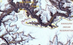
This map comes from a National Geographic multimedia feature that traced the route of two men who attempted to hike the length of the Grand Canyon in 2015—an 800-mile trek completed by fewer than two dozen people. Cartographer Charles Preppernau led a team that created a 3D digital rendering of the canyon.Then, they meticulously adjusted the lighting and color to maximize the sense of depth. Even the simulated snow (seen above) was carefully added in places where real snow would accumulate. “We really wanted to showcase the terrain of the canyon,” Preppernau says.
3.
MAP BY ELEANOR LUTZ, TABLETOPWHALE.COM
Medieval and Victorian maps of far-off lands were the inspiration for this map of Mars by Eleanor Lutz, a graduate student in biology and a science designer. The red circles indicate the landing sites (in some cases crash landings) of spacecraft sent by Earthling scientists. You can see the full version on Lutz’s science illustration blog and purchase a print, iPad case, or even leggings here.
4.
MAP BY FEDERAL OFFICE OF TOPOGRAPHY SWISSTOPO
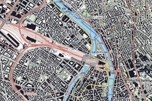
The Swiss national mapping agency, swisstopo, is renowned for maps that make the country’s mountainous terrain pop off the page. This year the agency has been updating its national map series, making its renderings of the entire country—including cities like Zurich, above—easier to read and more striking than ever.
5.
MAP BY PETER ALDHOUS FOR BUZZFEED NEWS
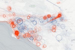
Journalist Peter Aldhous made this map for a BuzzFeed article about aerial surveillance of U.S. cities. This screenshot shows flights over Los Angeles made by the FBI (red) and the Department of Homeland Security (blue) between August and December of 2015. According to the article, the government planes are equipped with high-resolution cameras and, sometimes, cell-phone tracking devices. Their mission is to target drug smuggling, human trafficking, and other criminal activities. Circles indicate—you guessed it—planes circling over an area for prolonged surveillance.
6.
MAP BY ANDY WOODRUFF, AXIS MAPS
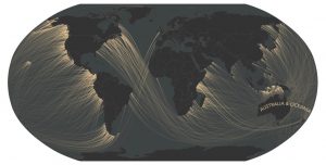
Have you ever looked out at the ocean and wondered what’s on the other side? Andy Woodruff has. Woodruff, a Boston-based cartographer, made a fascinating series of maps earlier this year that show, for any bit of coastline, which landmass you would encounter next if you were to walk, swim, or fly in a straight (and probably very long) line. The results are often unexpected, thanks to the intricate, jagged shapes of coastlines and due to the fact that the world is, of course, round. Setting out from the East Coast of the U.S., for example, you’d be more likely to hit Africa, South America, or possibly even Australia than Europe. (Don’t believe it? Consult a globe.)
7.
MAP BY LAUREN TIERNEY, NATIONAL GEOGRAPHIC
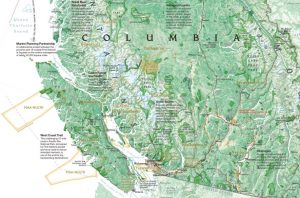
This detail from a supplemental map published with the September issue of National Geographic charts several storylines in British Columbia, from the history of First Nations people to the development of energy to the plight of salmon. The biggest challenge, says cartographer Lauren Tierney, was getting all this information onto the map without having it look cluttered—and without having any one storyline stand out more than the others. The team also worked hard to make sure the province’s rugged terrain was still visible underneath. “It’s a very drastic landscape,” Tierney says.
8.
PHOTOGRAPH BY OSHER MAP LIBRARY
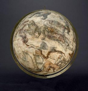
The Osher Map Library in Portland, Maine, recently began digitizing its collection of antique globes and putting them online. So far they’ve scanned eight globes (four more are in the works) and created an online 3D viewer that lets you see them from different angles, zoom in and out, even examine the elaborate stands that house them. The celestial globe above was made by the Dutch cartographer Willem Blaeu in 1603.
9.
MAP COURTESY © 2015 THE CITY OF LONDON
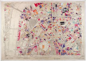
During World War II, British surveyors, architects, engineers, and construction workers mapped London’s bomb damage in real time, creating an incredible series of hand-colored maps. This one shows the area around Waterloo station.
10.
MAP COURTESY OF STANFORD UNIVERSITY
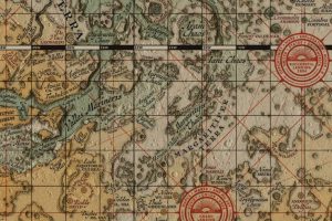
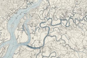
Secret Japanese military maps captured at the end of World War II have recently caught the attention of scholars interested in the environmental and geopolitical history of Asia. The maps, created from the 1870s through the 1940s, vary widely in style. Some are works of cartographic art; others were hastily sketched by spies operating behind enemy lines. The early 20th-century map above depicts the area around Pyongyang, North Korea.
11.
MAP BY SCOTT FARLEY, STARR MOSS, AND MEGHAN KELLY
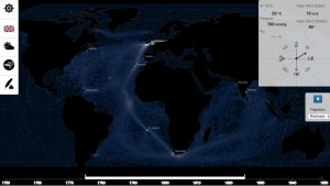
The screenshot above comes from an interactive map—created by three students at the University of Wisconsin, Madison—that explores the maritime world of the colonial era. The students compiled historical records of sea travel from 1750 to 1850, then created an interface that lets users select a colonial power—British, French, Dutch or Spanish—and see where their ships roamed. Users can also examine wind patterns, weather reports, and notes from the captains’ logs.
12.
MAP EXCERPTED FRM WHERE THE ANIMALS GO BY JAMES CHESHIRE AND OLIVER LUBERTI
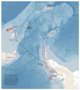
GPS and other technological advances are allowing scientists to track wild animals in more detail than ever before. Geographer James Cheshire and designer Oliver Uberti created 50 new maps of animal tracking data for their book, Where the Animals Go, published this year. The map above charts the wanderings of a single elephant seal in the Southern Ocean.
13.
MAP BY TIM MEKO, WASHINGTON POST
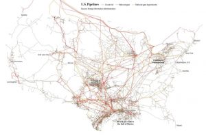
U.S. President-elect Donald Trump has said that he plans to invest $550 billion in improving the country’s bridges, roads, and other infrastructure. Earlier this month, The Washington Post published six maps to illustrate where and what that infrastructure is (and therefore where the money would be likely to go). This map shows the country’s pipeline network: 150,000 miles for oil, 1.5 million miles for natural gas.
14.

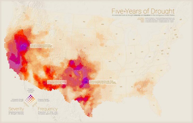
MAP BY JOHN NELSON
John Nelson, a cartographer at the mapping software company Esri, made this map to depict five years of drought conditions across the United States. The colors correspond to the severity of drought (purple is worst). More solid colors indicate where drought conditions have been present a higher percentage of the time.
15.
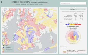
MAP BY MAPPING INEQUALITY
An interactive database launched this year allows anyone to search hundreds of maps and documents that contributed to housing discrimination beginning in the 1930s. The federal government created the Home Owners’ Loan Corporation to shore up the housing market during the Great Depression. But the local real-estate agents tasked with mapping the investment risks of different neighborhoods often used blatantly racist criteria, making it difficult—if not impossible—for people in minority neighborhoods to take out loans to buy a home. It’s a troubling legacy that’s now more open to study by academic and amateur historians alike.