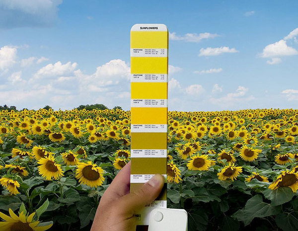
Italian graphic designer Andrea Antoni searches the world for Pantone colors, reminding us to embrace the colorful nature of our surroundings.
In each of his landscape studies, Antoni digitally inserts his hand with a swatch, containing complimentary Pantone shades that are represented in the background. From an orange tone, popping up in a melancholic sky, to playful collection of greens, flourishing in the freshly cut grass – these color decks illustrate how Andrea sees the world. For a more dramatic effect, Andre sometimes mirrors the image or manipulates it in other creative ways, making the compositions more appealing.
“As a graphic designer, I’ve always loved the Pantone fan decks, although more for their joyfulness and color than for their intended purpose,” Antoni told Creators. “So it happened one day that I took a particularly colorful picture and tried to combine it with the related Pantone color. Initially, I would publish the occasional picture once in a while, but now about one third of my published photos are produced this way.”
Through these pictures, Andrea also tries to preserve the nostalgic emotion, associated with a particular place. “The images reflect the way I see the world, or the memory I have of some places. Some show the sensations that these places evoke in me,” the artist said.
Texas-based artist Inka Mathew has created a similar project, pairing tiny everyday objects with Pantone swatches, and it looks just as vibrant.
More info: anreaantoni.it | Instagram (h/t: creators.vice)